Real-time visibility: the NEO commissioner dashboard
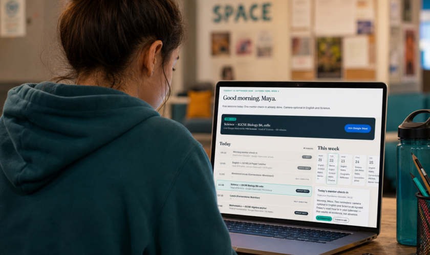
Two weeks into operation, our commissioner dashboards are live. This is the right moment to write up, for inclusion leads and AP commissioners, exactly what those dashboards show, how often they refresh, and the design decisions behind them.
The headline is simple. Same facts, appropriately framed. A learner, their family, and their commissioning Local Authority all look at the same underlying data — attendance, engagement, progress, safeguarding signals — but each gets the view they actually need. The data shape is one thing; the surfaces are three.
This post is about the commissioner surface.
What the commissioner dashboard contains
For each learner under your authority, the dashboard shows:
- Placement summary — start date, placement type (full-time, short-term/transitional, catch-up), the phase of education (KS3, KS4, KS5), and the induction status (e.g. “Initial 6-week induction, Week 3 of 6”).
- Attendance, last four weeks — a bar chart, week by week, showing the percentage of scheduled live sessions attended. Hover details show absences by session if you need them.
- Engagement, last four weeks — a separate trend line. Engagement is not the same as attendance and we treat it separately. A learner can be at every session and engaging at low ebb; another can have missed one but be deeply involved when present.
- Progress by subject — a stacked bar per subject (English, Mathematics, Science, History at launch, with more subjects as the cohort grows), showing where the learner is against the term’s milestones. Where Pearson Edexcel International GCSE modular assessment is happening, the modular completion status is shown alongside.
- Safeguarding status — a top-level indicator: Green, Amber, Red. Green means no open concerns. Amber and Red carry the corresponding flag, the DSL’s name and contact, and the trail of communication between the DSL and your safeguarding team.
- Compliance visible by default — all mandatory commissioner fields complete, all consents on file, all current.
- Reports and exports — download a snapshot, schedule a regular email digest, or pull data into your own reporting via a CSV export.
- OEAS readiness — for the school as a whole, the status of our accreditation milestones.
Why “refreshed after every session” matters
Most AP reporting still happens on a termly cycle. A meeting, a paper, a set of percentages — six weeks of activity summarised once. That cycle is sometimes appropriate (governance bodies, contract review) but it is the wrong cycle for the live management of a single young person’s placement.
NEO’s commissioner dashboard refreshes after every session. That means by the end of a Tuesday at NEO, your dashboard for a learner under your authority has Tuesday’s attendance, Tuesday’s engagement signal, Tuesday’s safeguarding status, and Tuesday’s note from the practitioner — written in plain language.
The point is not to flood your inbox with every detail. The point is that when you do log in — to prepare for a panel, to brief a colleague, to answer a parent’s question — what you see is what’s actually happening, not a memory of what was happening five weeks ago.
The “same facts, appropriately framed” principle
We are explicit about this design decision. The learner does not get a different version of the truth from the one their family or commissioner sees. The facts — sessions attended, work submitted, signals raised — are the same. What changes by surface is:
The level of detail (the commissioner sees aggregate trends; the learner sees their own week). The framing (the learner’s view leads with “your week”; the commissioner’s leads with placement metrics; the family’s sits in between). The interactions available (the learner can ask the practitioner a question from their view; the commissioner can download a report from theirs).
We don’t show one audience something we hide from another. Where a safeguarding signal exists, the family can see that one exists (without seeing every detail, where that’s not appropriate) and the commissioner sees what their role requires them to see.
What we don’t put on the dashboard
A few things, deliberately.
We don’t display rolling year-on-year comparisons against arbitrary benchmarks. NEO learners come from situations where benchmarking against a typical school cohort is rarely useful and often misleading. Where progress matters most — distance travelled from the learner’s own baseline — we show it.
We don’t have a “concern score” or “wellbeing score” for each learner. We don’t try to compress a young person’s situation into a number. Concerns travel through the practitioner and the DSL, through named conversations.
We don’t show speculative data. Every figure has a source — a session attended, a piece of work submitted, a check-in completed — and the source is one click away.
If you want a closer look
The open day demo includes the commissioner view, with three composite learners showing the full data shape. Walk through it and pick “Enter as a commissioner”.
If you’d like the schema and the data shape for a procurement conversation — for example, to check it’s compatible with your own data warehouse or governance reporting — we’ll send the technical brief on request to neo@nudgeeducation.co.uk.
More articles
Go to the blog